Using
Page Layout Software
module last modified: February 14, 2002
Adobe
Illustrator 9
PLATFORM
You can do this module all the way through on either the Mac
or the PC side of the CCLI. A few steps below will vary if depending
on the platform you are using.
Opening and setting up the program
- Open
Adobe Illustrator 9
On the Mac, go to the rainbow apple>Local Applications>Adobe
Illustrator 9.
On the PC, go to Start>Programs>Graphics and
Drawing>Illustrator9.
.
- When
the application opens, you will see some tool palettes. Keep
all of the palettes except for the "color/attributes"
palette. You will use all of the other ones.
- Find
the window like the one below and make sure the "Info"
tab is showing. If you don't see this pallette, go to Window>Show
Info
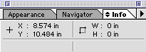
Move the cursor all over screen, and notice how there are
readings for the horizontal (x) and vertical (y) positions
of the cursor.
Making
a circle, making some text....
- Choose the Ellipse
tool from the tool palette.
This tool looks like this:

This tool is for drawing circles and ellipses.
- Move the tool
over the page on screen, and hold down the shift key (holding down the shift
key allows you to make circles). Hold down the mouse button, and drag down
and to the right.
You will be drawing a circle. Notice how, in the Info box, the width and height
of your circle are appearing as you draw. Make the circle be 3.5" in
diameter (both the height and width will be the same).
To make your circle exactly 3.5 inches, click the transform tab and type in
the dimensions. See window below:
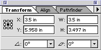
If the "Transform" Panel is not visible, got to Window>Show Transform
- Choose the black
selection arrow on the tool pallet and then click on your canvas AWAY from
the circle so that it is no longer selected.
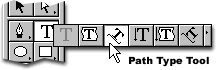
- Choose the Text
tool. This looks like a "T". Hold down the little arrow in the corner
of the "T" box and choose the "path type tool". This tool
allows you to type text around your circle:
- With the text
tool, click on the top of the circle line and type your name (with an apostrophe
and an "s"). The text will flow around the circle. Now use the arrow
tool to grab the I-beam and pull the text around the circle until it is aligned
at the top equally on each side like the picture below:

- Use the Text
tool to drag-select all your words, so that you can change their typeface
and size: with the Text tool, click the mouse before the first word, and then
hold the mouse down and drag over the words you typed.
From the Type menu, choose a font you like for your words, and a size (make
it 48 points). You can also use the "Character/Paragraph" pallette
to change type size and font on the workspace. If it's not on the workspace
then go to Type>Character to display the pallette. Make sure you choose
the "Character" tab.
- Under the "Window"
menu make sure that "Show Layers" is not there. If it is, choose
"show layers" so that the layers dialog box (shown below) is on
the workspace.

- Now, repeat
steps 2-6, except for the following changes;
- Make the
circle 4.2 inches in diameter this time
- If color
fills the circle, click on the small black "Fill" box on the
bottom of the Tool Pallette

- Type "World"
instead of your name and using the pointer, grab the I-beam and drag the
text to the bottom of the circle.
- Double click
on the I-Beam and the text will jump to the inside of the circle.
- Align it
with the bottom of the circle again.
- Make sure
it looks like the circle below.

Bringing
in a graphic from a painting program
- First, you will
need to make a new layer. You can do this in several ways. You can:
- Click the
small black triangle on the "Layers Pallet" and choose "New
Layer"
OR
- Click the
icon next to the trashcan on the bottom of the Layers Pallet (it looks
like a page with the bottom left corner turned up)
- Select Layer
2 by clicking it once
- Next, choose
"Place..." from the File menu.
A dialog box will appear. Find the "Globe.eps" file– it is
in the Reference folder on the Groups Drive. Make sure that the little box
for "link" is not checked. Double-click the "Globe.eps"
file when you can see it in the place dialog box.
The globe graphic will appear on your screen. We'll take care of its placement
in a minute.
- Next you will
select all of the objects on the workspace. You can do this a few ways. The
fastest is to use the keyboard: On the Mac, push the "command" (the
command key has a clover-leaf like image on it) key and the "A"
key; on the PC push the "Ctrl" key and the "A" key. You
can also go to Edit>Select All. Your two circles and the box with the globe
will all be selected.
- Find the "Info/Transform/Align"
dialog box. Click on the "Align" tab. Under the "Align Objects"
row click both on "Horizontal Align Center" and "Vertical Align
Center". These are the second and fifth buttons respectively. All of
your objects are now aligned.
- Click somewhere
on the workspace to undo the "Select All" function. Now click only
on the box that is holding the globe. The lines should turn red. You are now
going to arrange the figures so that they do not 'bury' one another. Under
the "Object" menu choose "Arrange" and "Send to Back".
Now click on the layer with your name on it. It will appear as a square with
blue lines. Go to the "Arrange" function and choose "Bring
to Front". You may have to make some manual adjustments by clicking on
the Black Selection Arrow and using the arrow keys on the keyboard.
Adding
another shape, adding some more text
Now you will add a new shape to the logo and learn how to change its color.
You will also add a new word and learn how to change its color. And finally,
you will align all the elements again.
- Choose the Rectangle
tool (this is directly beside the Ellipse tool). Make sure you are working
in Layer 1 still.
Draw a small thin (approx. 5.5 x 0.3 in.) rectangle somewhere under the globe
and text.
When you make an object, it will be selected: it will have small squares at
its corners to show that it is the object you want the computer to modify.
If you deselect the rectangle before or during the next step, click it with
the Arrow tool to reselect it.
- In the Swatches
palette, click the "Swatches" tab.
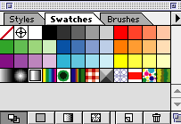
This option allows you to check and modify the Fill color of an object.
Choose one of the swatches, either solid color or pattern. You can change
the assortment of swatches at the bottom of the palette. Remember that the
newsletter will be in Black and White, thus colors will change to grayscale.
Click on one of the little squares on the swatch palette. Your rectangle will
fill with the swatch you chose. If it doesn't, go to Object and click on Expand
Fill.
- Make sure the
rectangle is still selected (it will have small blue rectangles in each of
its corners–if it is not selected, choose the arrow tool, and click it).
- Choose the Text
tool (the one that looks like "T"). Make sure you are using the
default text tool and not the path text tool that you used for putting text
on your circles. Click somewhere on screen below the thin rectangle to get
the Text dialog box. Type "NEWS", and choose some big bold font
for the word. Make it be 72 points tall. Choose the "Paragraph"
tab and center your highlighted text. Use the second button that says "Align
Center" when you put the mouse over it.
- Select all of
the layers using the mouse arrow and shift key. Go to the "Layers"
palette. Click on the arrow at the right of the word Layers. Choose "Merge
Selected ". This will put all of the layers you made into one.
With all the objects selected, choose the "Align" tab and align
both horizontal and vertical again.
Some of your objects may disappear. Do not worry. Here is how to order the
objects so that they do not bury one another. Remember the "Arrange"
function under the "Object" menu? You will use the different options
here to arrange the order of your objects. This is the order in which your
objects should be from top to bottom: Text-Globe-Rectangle. [The thin rectangle
box should be "sent to back". That way it will be at the very bottom
of the layers. Next click on the globe. The globe should be "sent backwards".
Now click on the text box with ‘NEWS' inside. This box should be "brought
to front".]
You may want to change the color of your "News" text so that it
doesn't blend into the globe. Do this by selecting the text with the Text
tool and then using the "Color" pallette to select a lighter shade
of gray (remember that this logo will be used in a black and white document,
so selecting a non-gray color will mean that the computer will ultimately
determine exactly what color this text shows up as).
- There are a
few last things you need to do in order to use your logo in the newsletter:
- first groups
all of the objects. Select all again (drag the mouse over all objects
while holding the shift key or hit Command + A on a Mac or Control + A
on a PC).
- Next choose
"Group" from the "Object" menu. Now save your logo
on your home directory. (When you do this, you may get an additional dialogue
box which asks you if you want to embed fonts. Click this option. You
may also get a dialogue box with the option 'Include placed objects. Click
in the checkbox.) Save it as an .ai file in the Groups drive, under the
turn-in folder, your folder, an Illustrator folder and call the file your_userid_Illustrator.
- Your final logo
should look something like this:

Bonus
Points
To earn
the bonus
points for this assigment, create a second logo using a different image and
different text. Feel free to get creative and to use color so that the logo
is more representative of your personality. It should be something that you
would be comfortable using for other projects such as an online portfolio. To
earn full points, your new logo must contain at least five different elements
(like the one above does) and show evidence of you learning at least one new
feature of Illustrator. Experiment and have fun.
TURNING
IN YOUR WORK
Turn in all files electronically to the Groups Drive on or before the due date.
POINTS
Turned in on time..........10
Completed logo.............65
Instructor discretion........10
Bonus Tasks
Bonus Points............15
Total Points...........100
Return
to Schedule